When designing your exterior business signs, choosing the best font for the signage takes a lot of time and consideration. The font style on business signs should be both easy to read and big enough to see from a distance. If you are in the market for new outdoor business signs, continue reading to learn our tips concerning font styles for business signage.
Prioritize Legibility
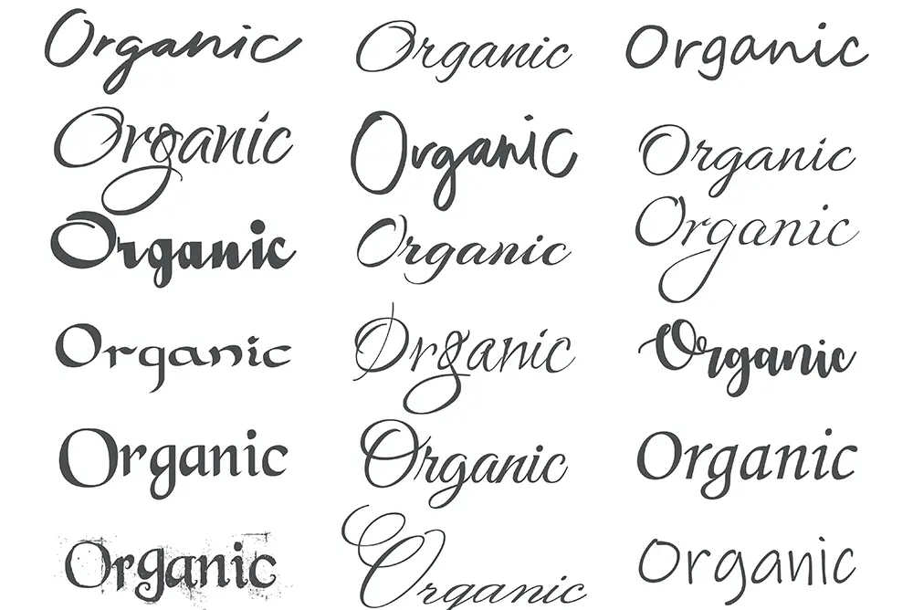
There is little to no point in having exterior business signs if nobody can read them in a split second. A good rule of thumb is avoiding script-style fonts that feature cursive or fancy lettering. While this font style is applicable in some instances, it is often too difficult to read on business signs. Remain focused on your customers’ needs and make your custom business signs as legible as possible for the sake of both parties.
Capture Attention, Then Inform
Business signs should be functional and informative. Plan out how you want your signage to grab people’s attention. This step will put you on the right track toward boosting foot traffic.
Style choice affects the delivery of a written message for any commercial business sign. Think about your favorite restaurant. Their font style and overall signage design likely seem inviting and visually appealing to you. If you were to see one of their commercial business signs while driving around, you would most likely recognize it. Try to incorporate the best qualities you see in your favorite outdoor business signs and use that as inspiration for your branding.
Some organizations have the resources to design their own business sign from scratch. However, many small businesses need to have that kind of luxury. No matter the size of your organization, begin the design process by selecting a distinctive font style that draws attention to itself. Make mock-ups and compare each of them, then go from there to narrow it down to your favorite ones.
Serif vs. San Serif
Serif fonts have little lines (referred to as “feet”) protruding on the ends of each letter. Times New Roman is an example of a serif font. These fonts are easy on the eyes, but some consider them old-fashioned or too conservative. San serif font styles like Arial have a cleaner look since they have no feet, and many view san serif fonts as modern or robust.
Professional services such as law offices tend to lean towards using serif fonts since these typefaces portray sophistication and refinement. Other types of businesses opt for san serif fonts because their brand needs a bolder typeface. Look at your business and determine whether a serif or san serif font meshes best with your branding. This step will narrow down the pool of possible font styles to include on your custom business signs.
Uppercase vs. Lowercase
Our eyes can read all lowercase letters faster and easier than all uppercase letters. If you are on the fence about capitalizing letters on your business signs, a good bet is to stick with all lowercase instead. All uppercase letters may be seen as “shouting,” so use your best judgment with the use of uppercase and lowercase letters.
Using either all uppercase or all lowercase works best on outdoor business signs. Even though this is a common practice, it is not a hard and fast rule. Most people are used to seeing uppercase and lowercase lettering when they read written text. If your business name is long, combine uppercase and lowercase lettering in your commercial business signs.
Color, Contrast, and Value
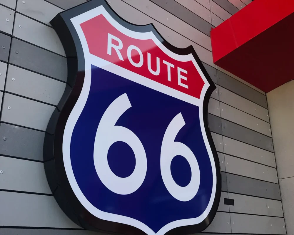
In color theory, a “value” pinpoints the exact levels of light and darkness in a specific color or hue. So many people use black-and-white color combinations for their exterior business signs because the high contrast of these colors makes them instantly readable. Blue and white could be other high-visibility contrasting colors to consider for your business signs.
Color plays a significant role in branding, and it is best to select contrasting colors for all of your business signs. Less contrast between two colors makes it harder to discern the edges, thus making letters on an outdoor business sign more challenging to read.
Less is More
Stick to just one or two fonts on your business signage. Two is the maximum number of font styles you should have on custom business signs. If you use more than two fonts, it will start to make the sign look too busy.
It will work in your favor to keep it simple so that your customers can understand what your business sign says. By the same token, you should also stick to no more than two colors (maybe three in some cases) on your commercial business signs.
Keep the Brand Consistent
Logos are essential, but the overall look and feel of your font styles on your outdoor business signs will directly reflect your brand. Whatever design elements and font style(s) you choose, be consistent with them and use them on all the business signs and business-related literature you currently use. This practice will encourage brand recognition, making it easy for customers to remember who you are no matter where they see your signage. Staying with the same branding across the board eliminates any confusion your customers may have otherwise encountered.
Conclusion
Designing business signs is a complex task, which is why it is of utmost importance to find the right design team. At Resource 4 Signs, our team is ready to help you develop the most optimal commercial business signs for your company.
Whether you need to rebrand or start a new business in the Los Angeles area, you can count on our hired team of professionals to make and install all your custom outdoor business signs.


