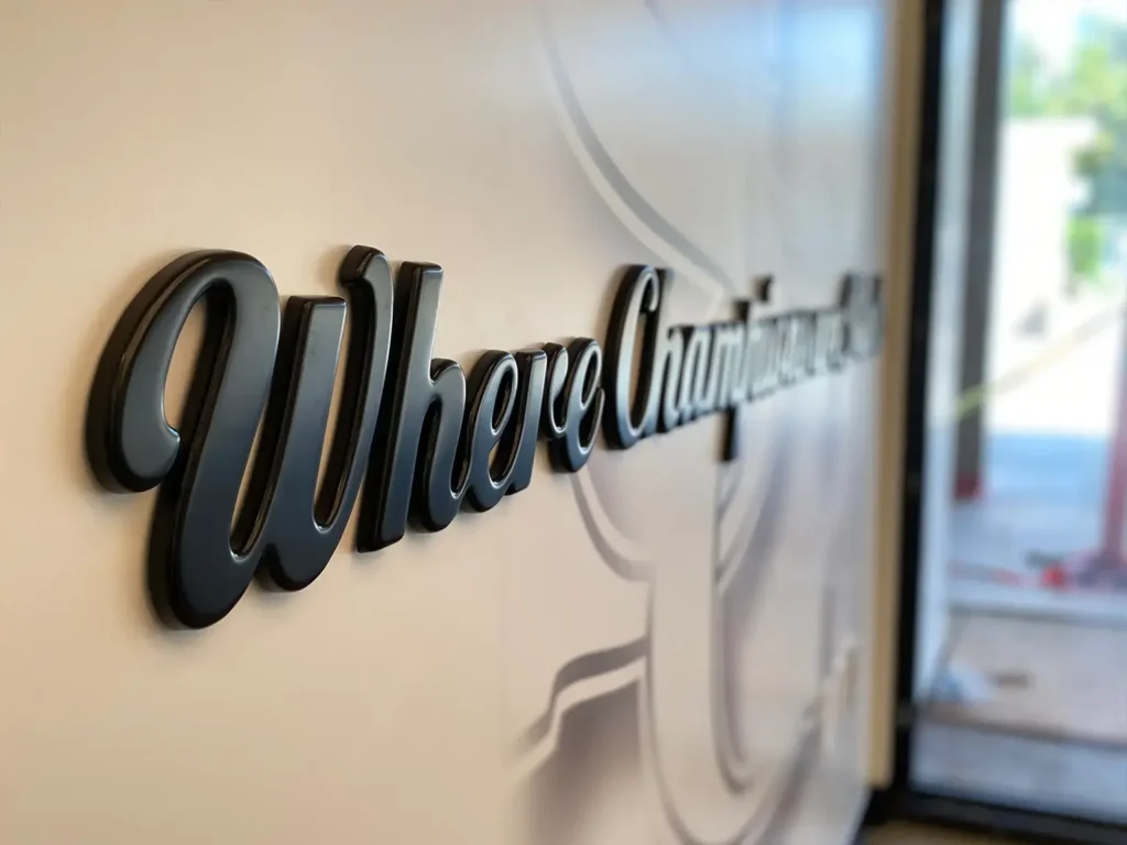
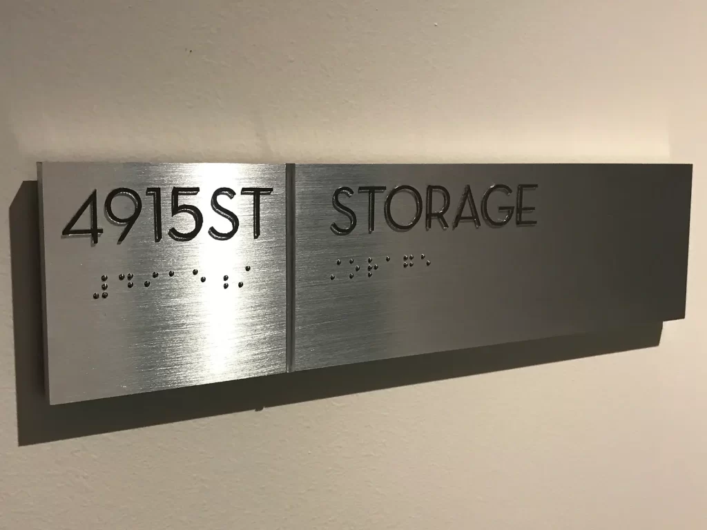
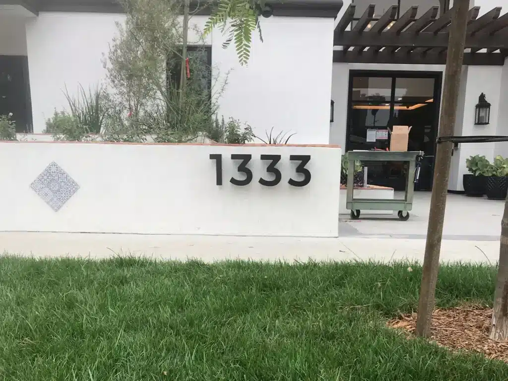
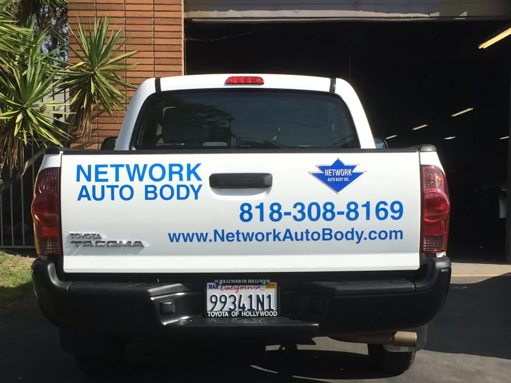
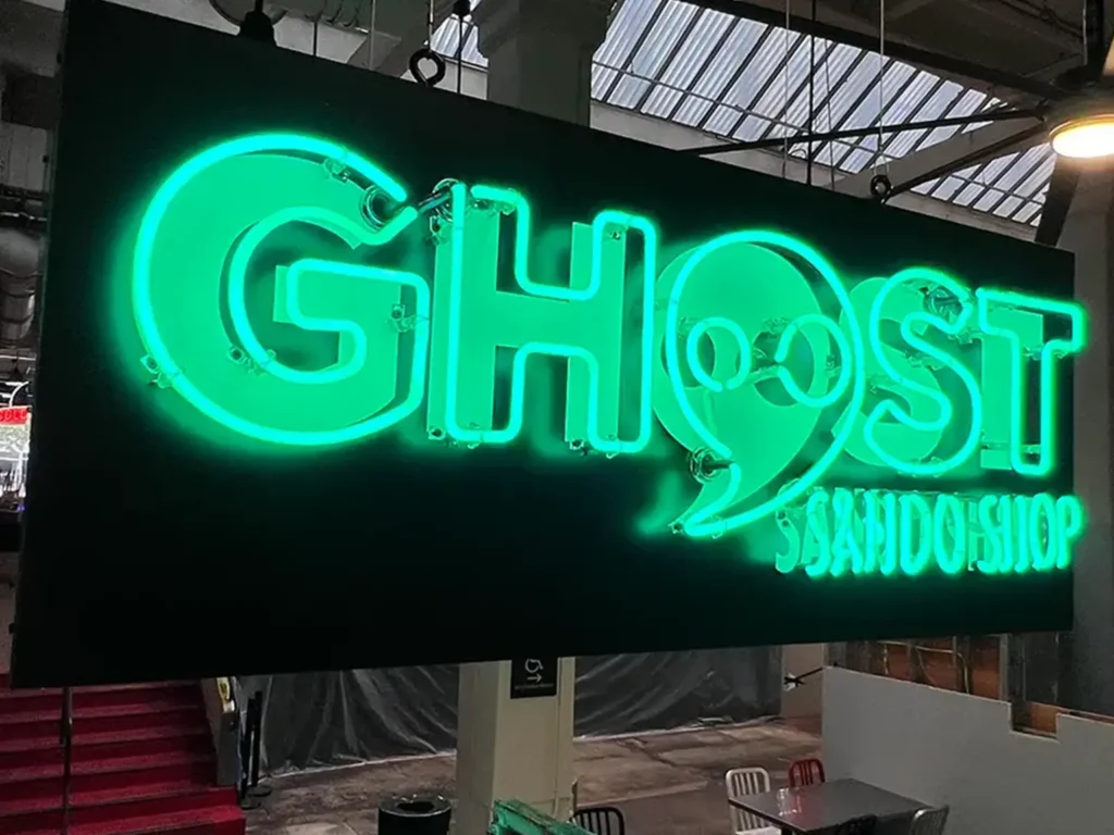
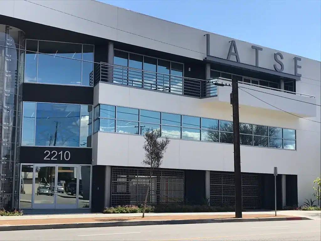
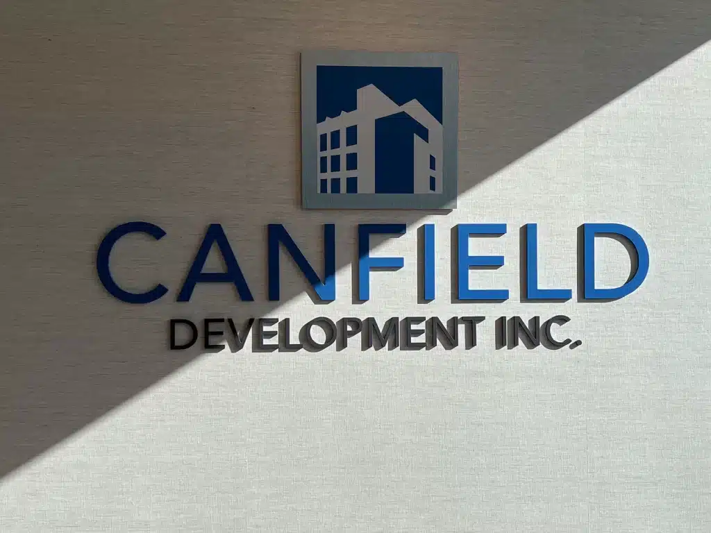
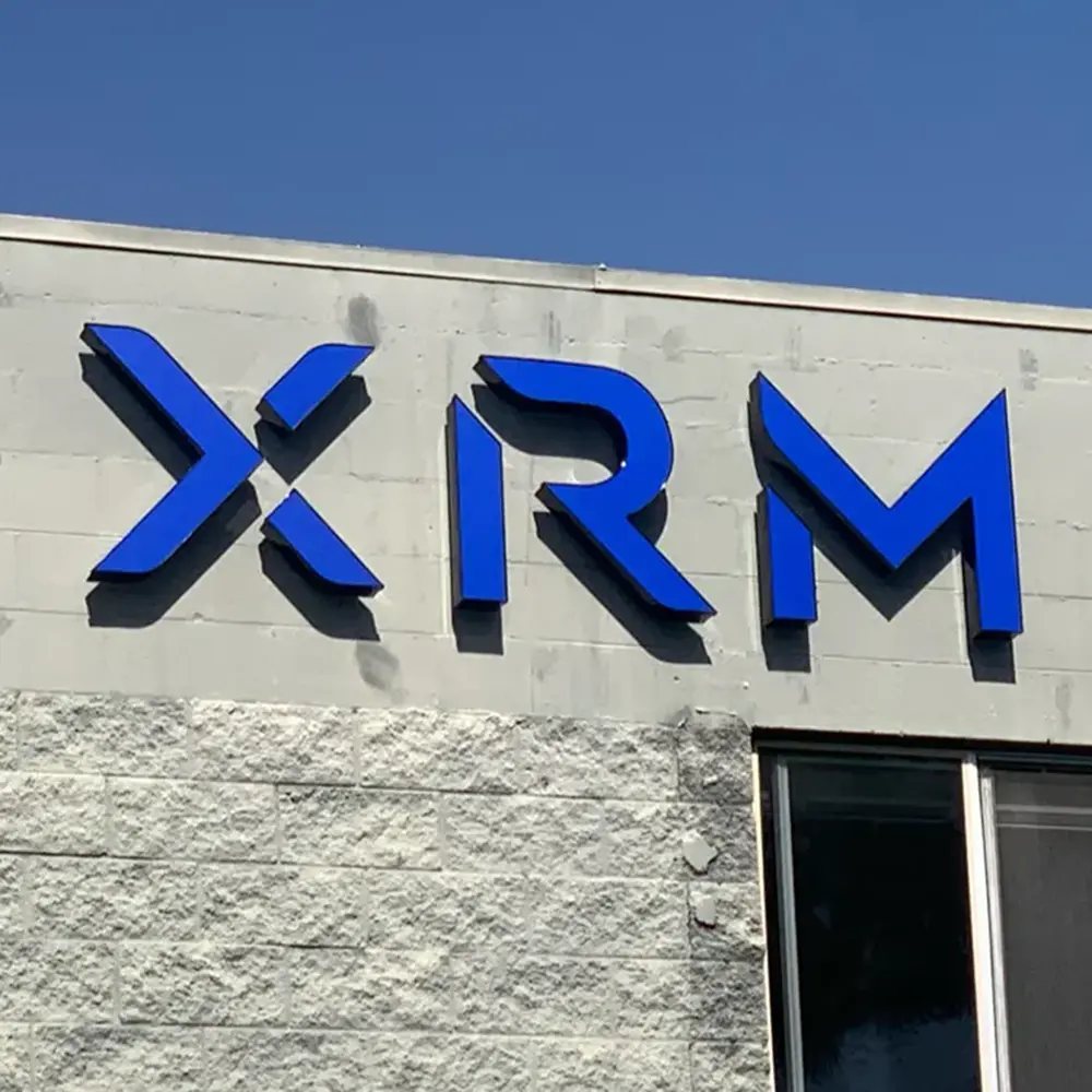
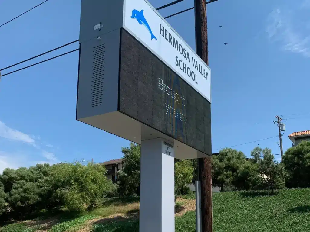
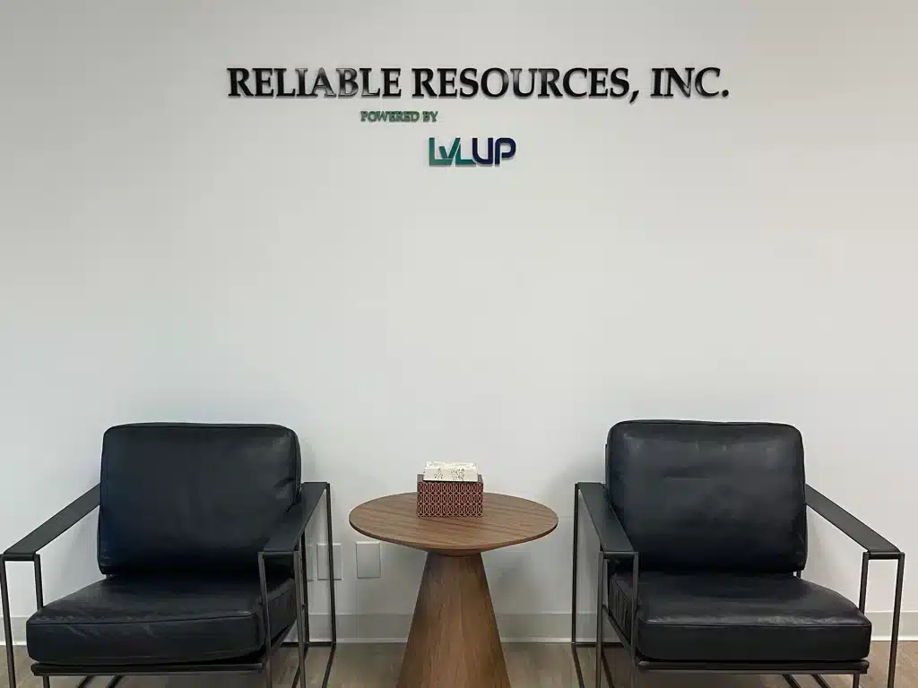
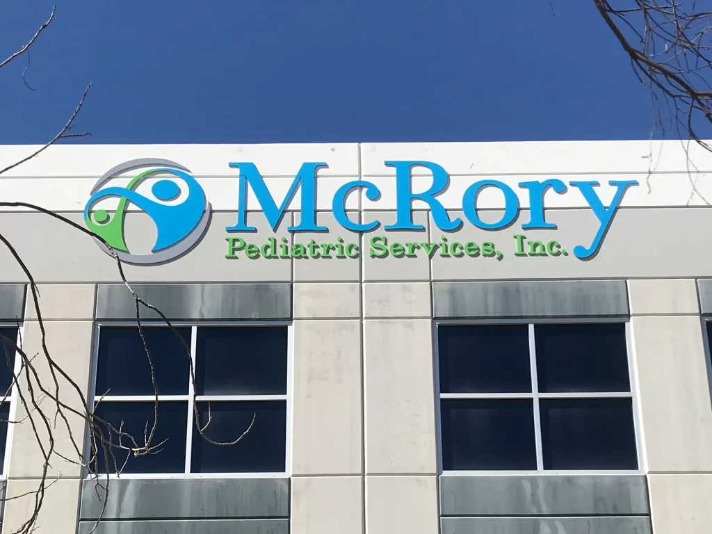
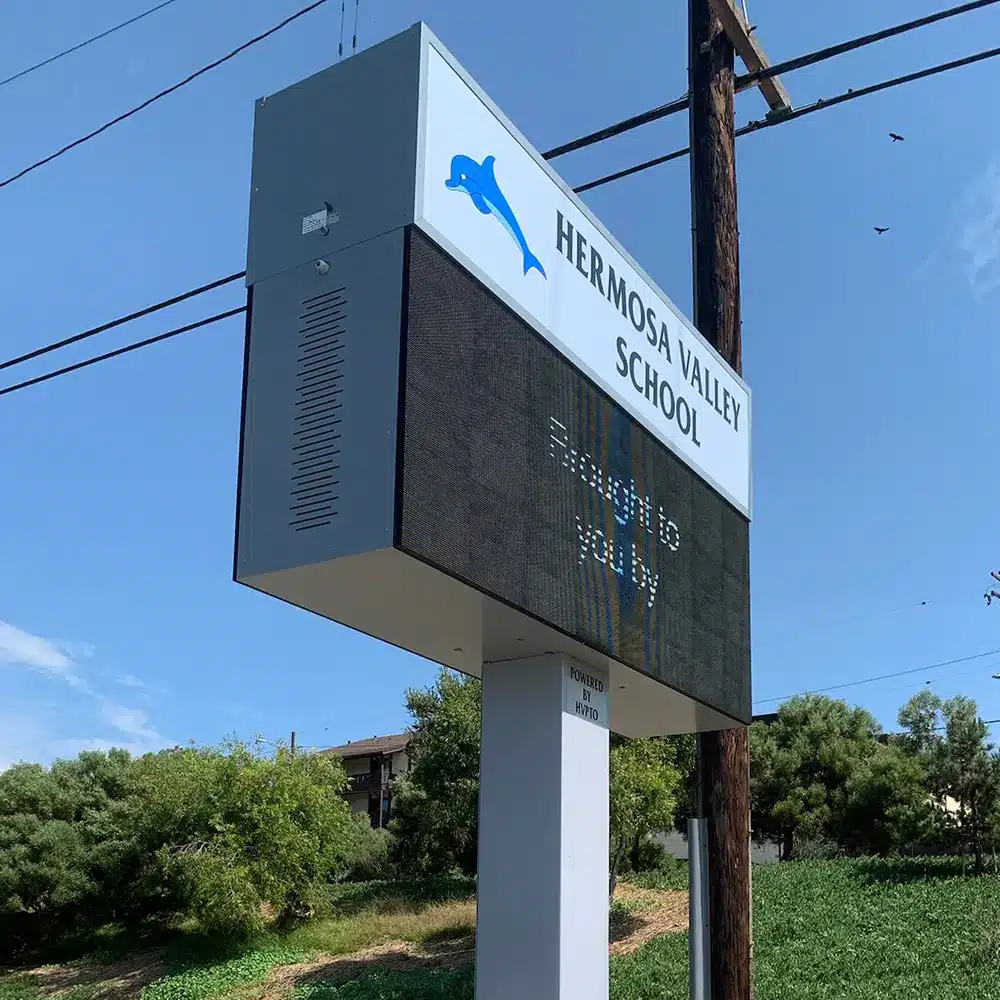
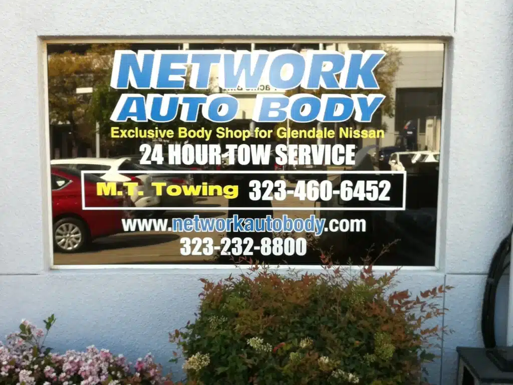
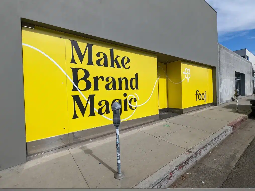
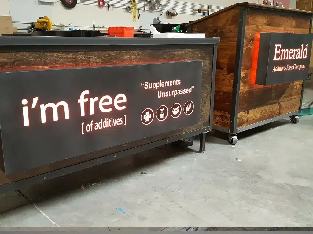
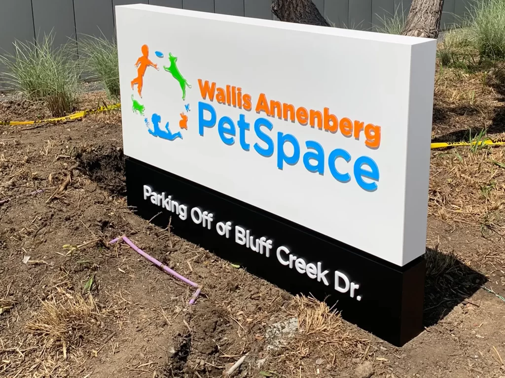
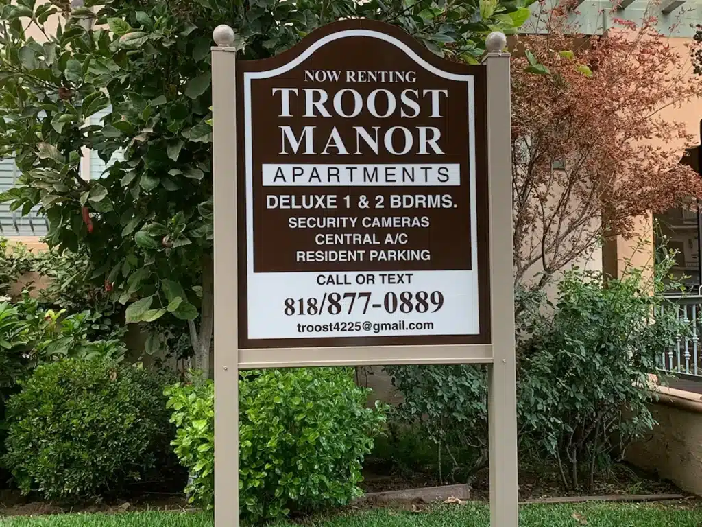
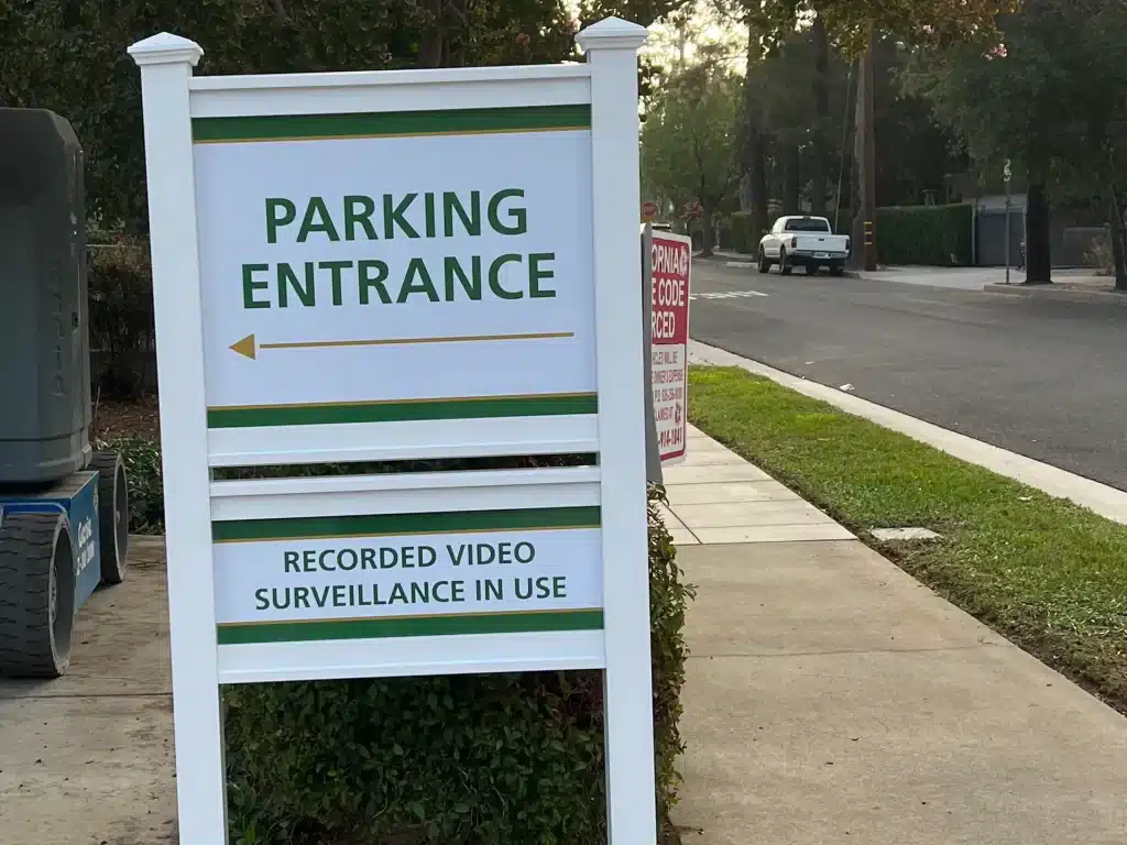
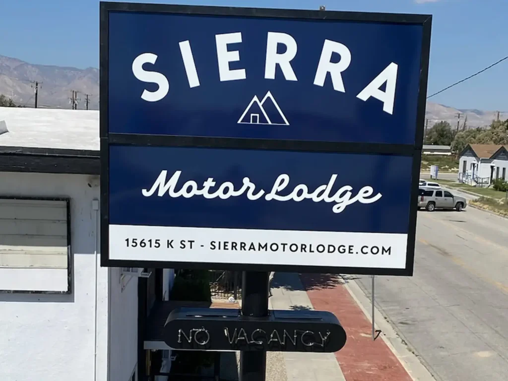
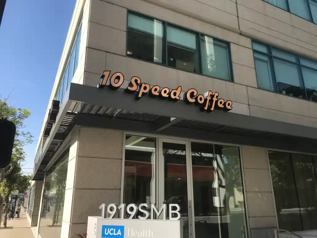
Morton Capital Management needed new faces for their double-sided monument sign. As you can see from the photos, they needed to update the sign due to a logo change, and we made them push-thru acrylic letters.
The first step we take when we’re updating an existing sign is to go to the location to get photos and measurements of the existing sign. As we were just replacing the faces, we needed to know the exact measurements in order to determine the size of the new faces we were making. We received the artwork of what they wanted on the sign from Orange Identity, the digital marketing company they were working with. The sign was to look identical on both sides, with the logo and tagline made from edge-lit letters.
In early designs, we considered a dark gray background with metallic letters. After seeing a rendering, the client decided that this wasn’t the look they wanted for the sign and asked to see the lettering in dark gray to match the new building sign, on a background painted to match the existing monument sign face. They were much happier with this color scheme and this design was finalized.
To make the sign faces, we created new aluminum panels that we painted and routed the letters out of. The logo and tagline were created from clear acrylic and the faces had vinyl on them so the sides of the letters would light up at nighttime. The monument sign had a light source inside already. These are called “push-thru” letters because it looks like the letters are pushed through from the back. We gave the client a few different options of dark gray vinyl colors but they ended up going with black vinyl after we sent them some sample photos of how it would look at nighttime.
The new logo looks great on their monument sign and is sure to make an impression both in the daytime and at nighttime.