Industry News
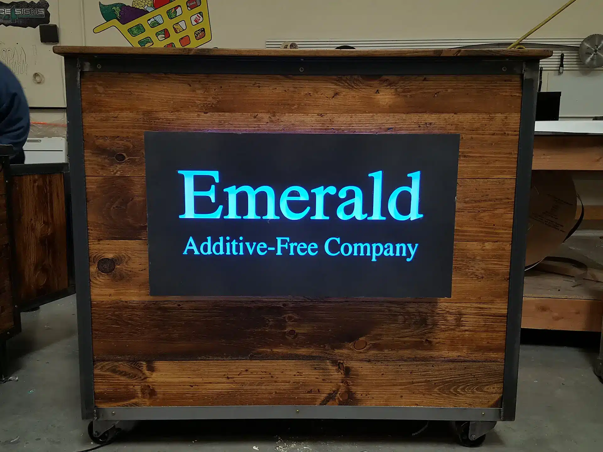
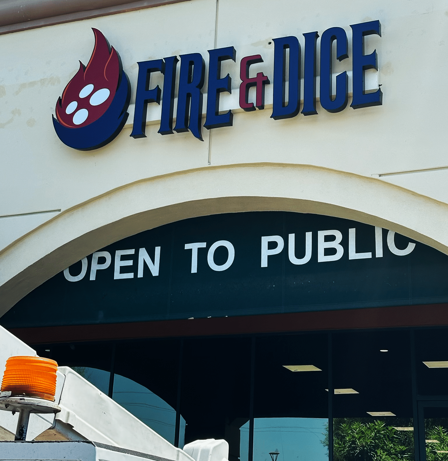
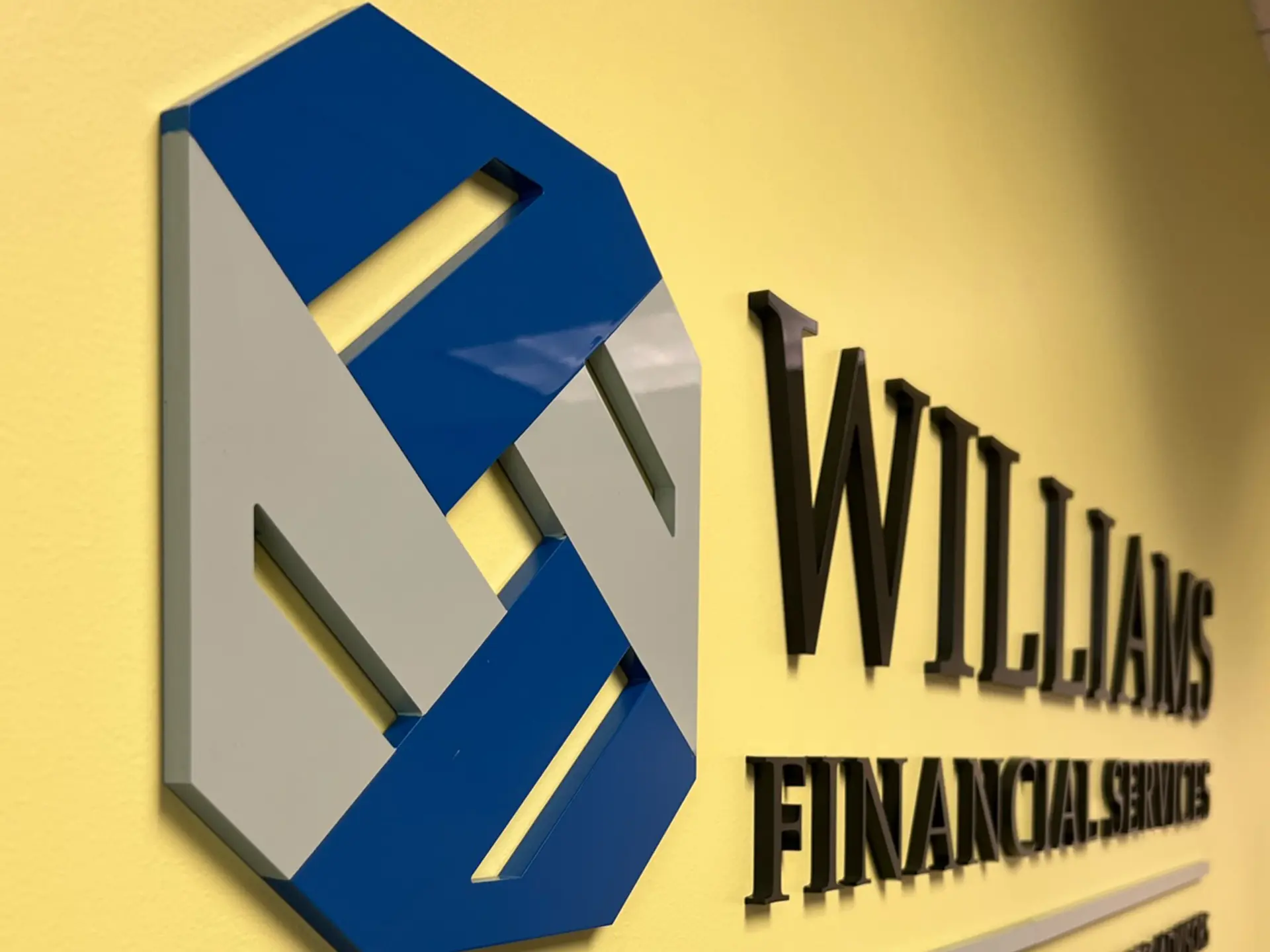
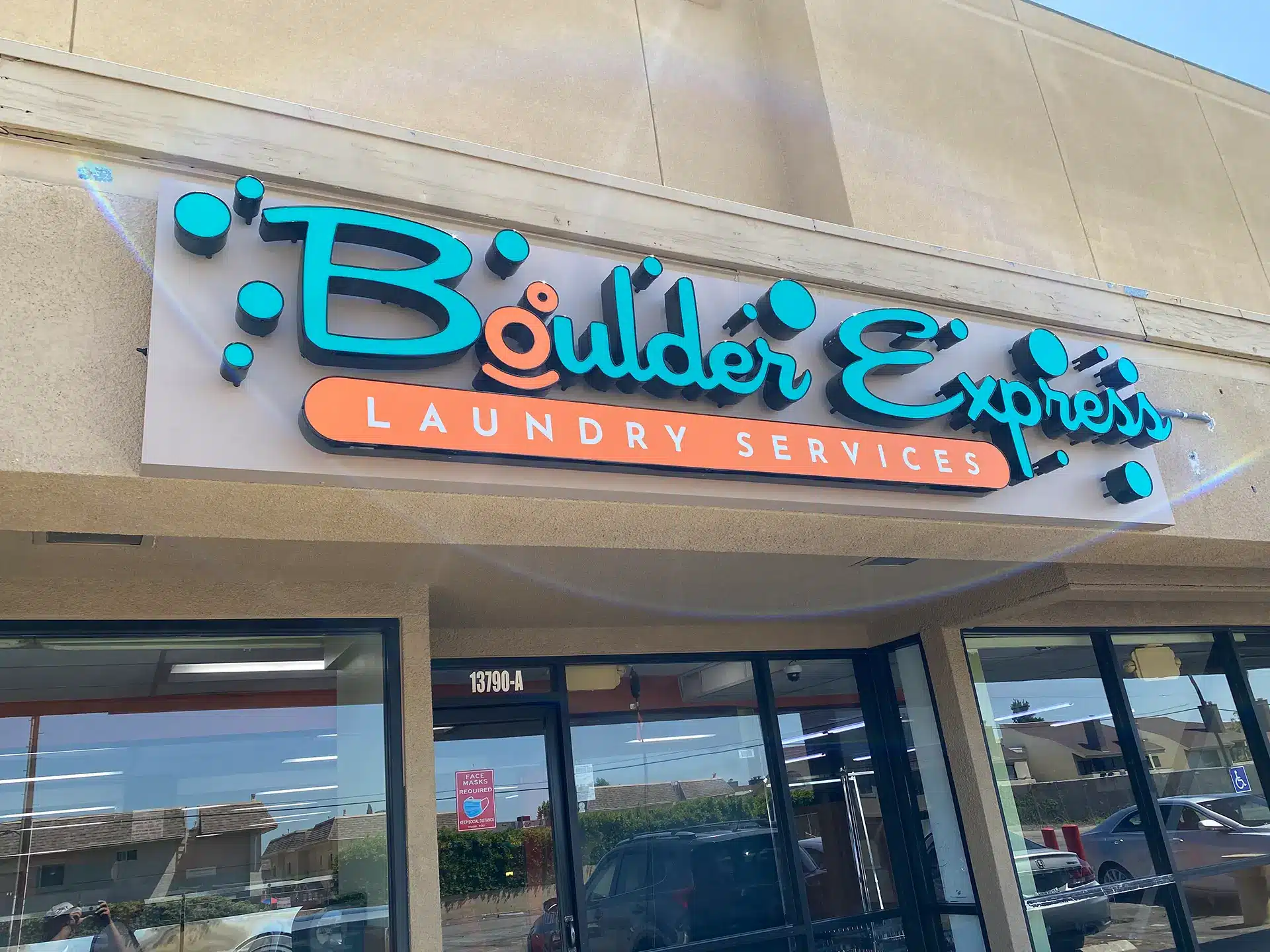
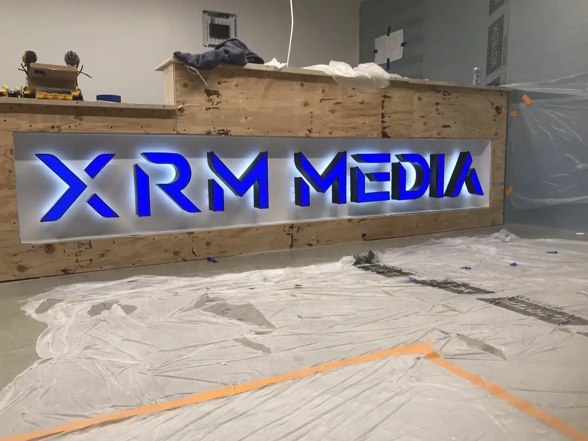
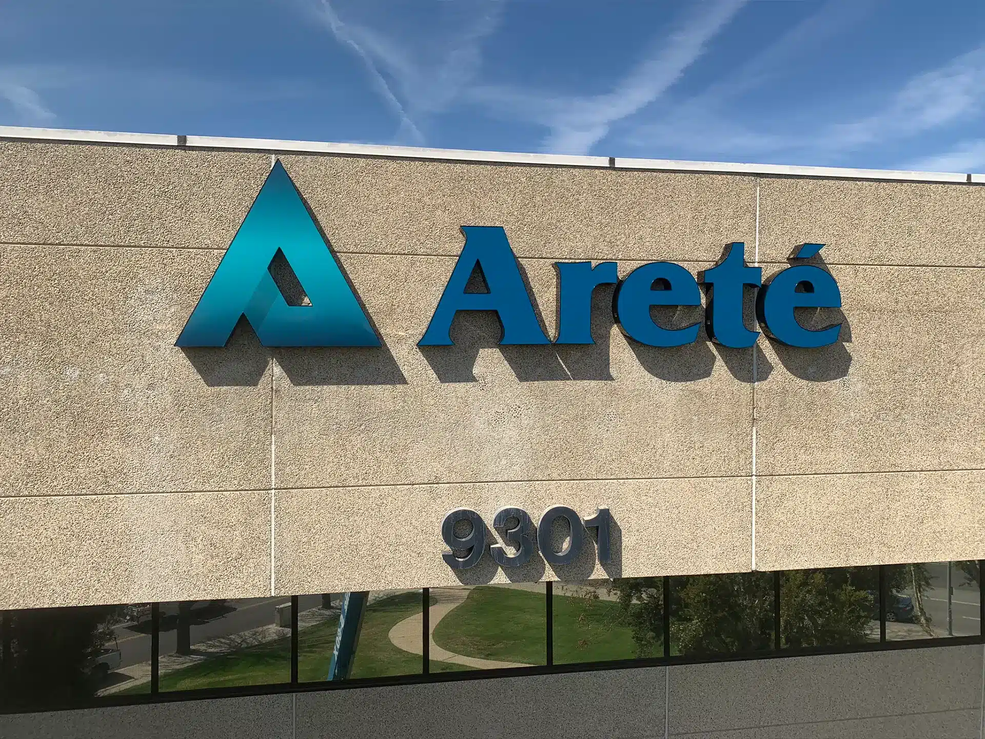
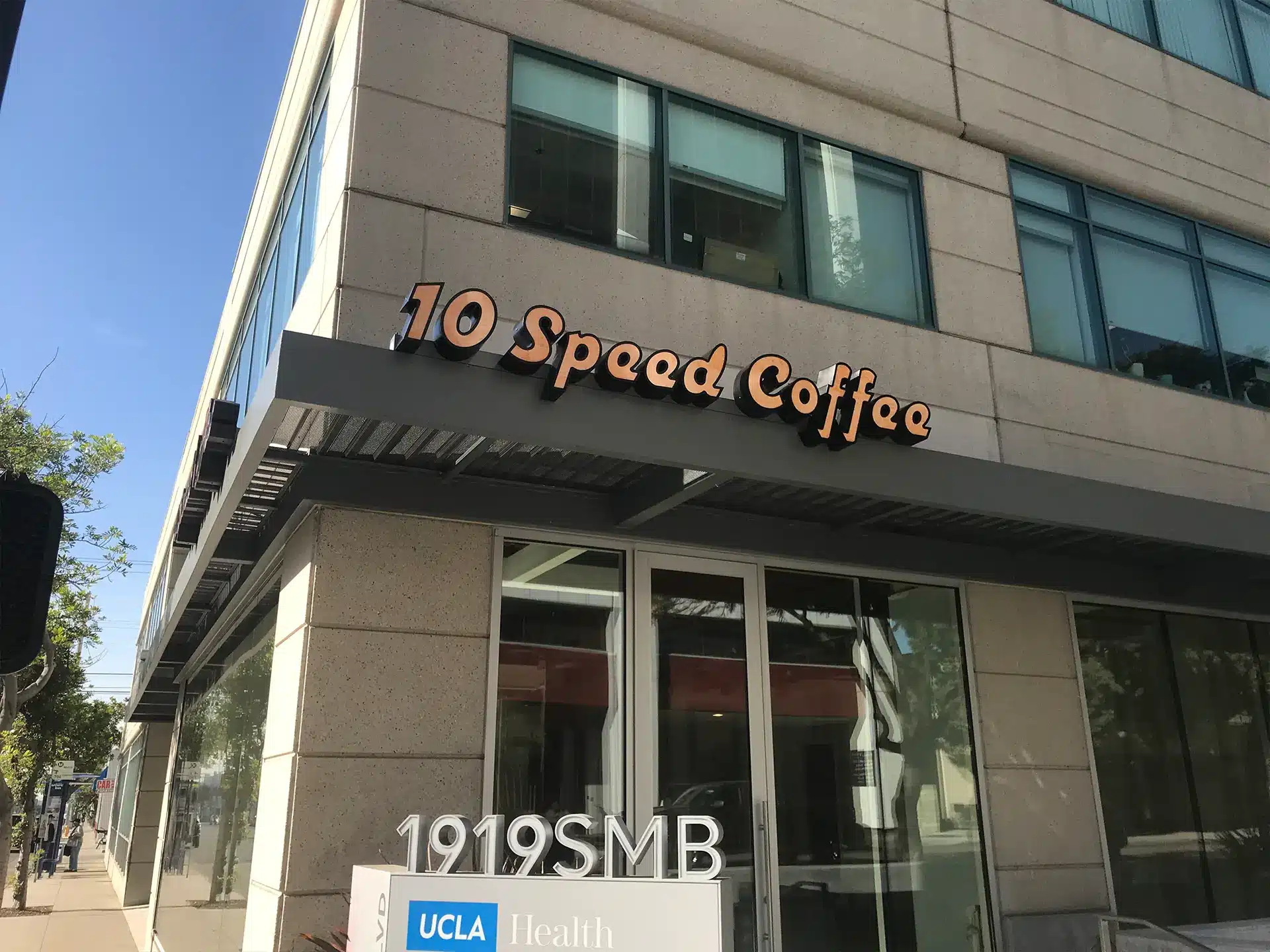
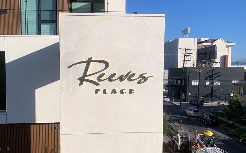
Our Approach to Dimensional Letter Signage Solutions
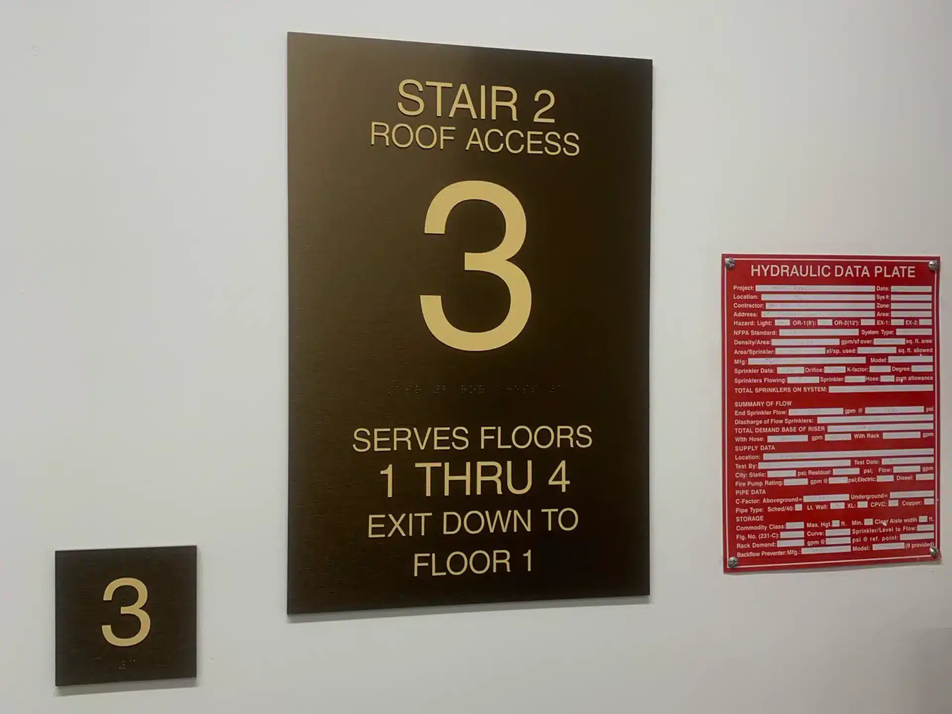
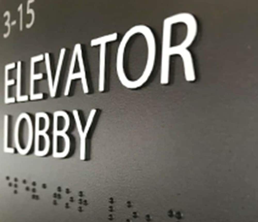
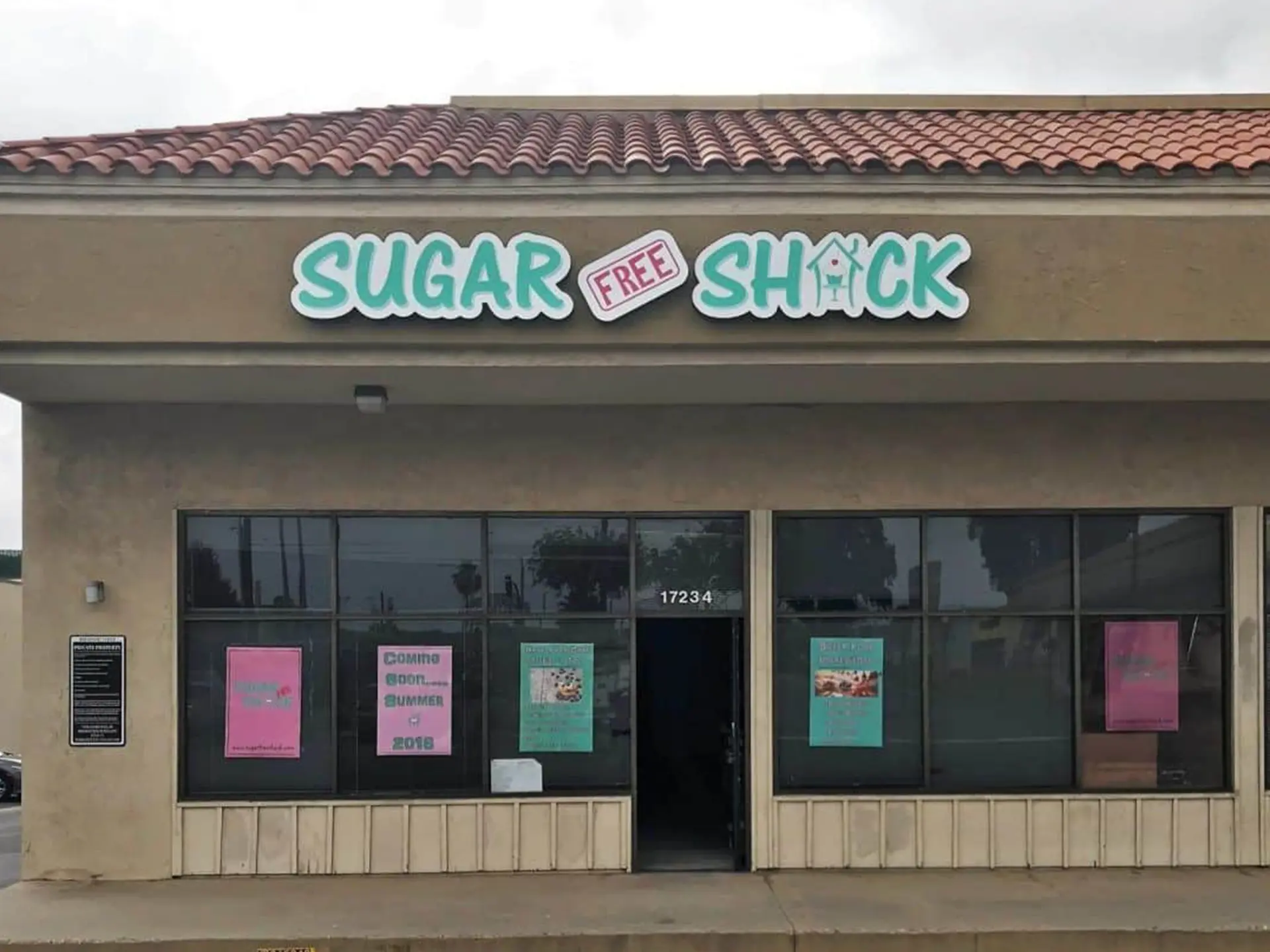
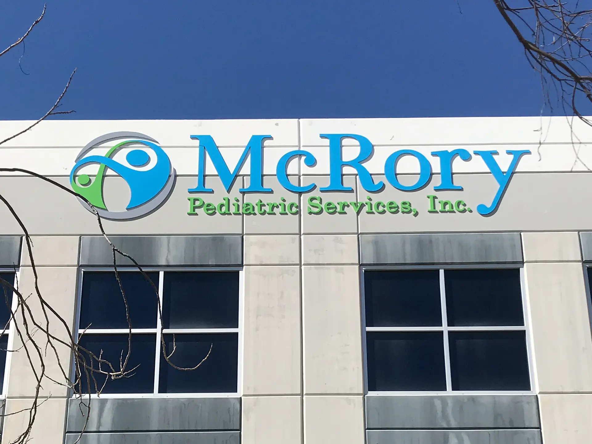
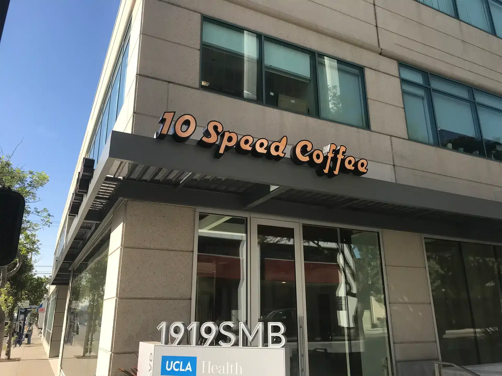
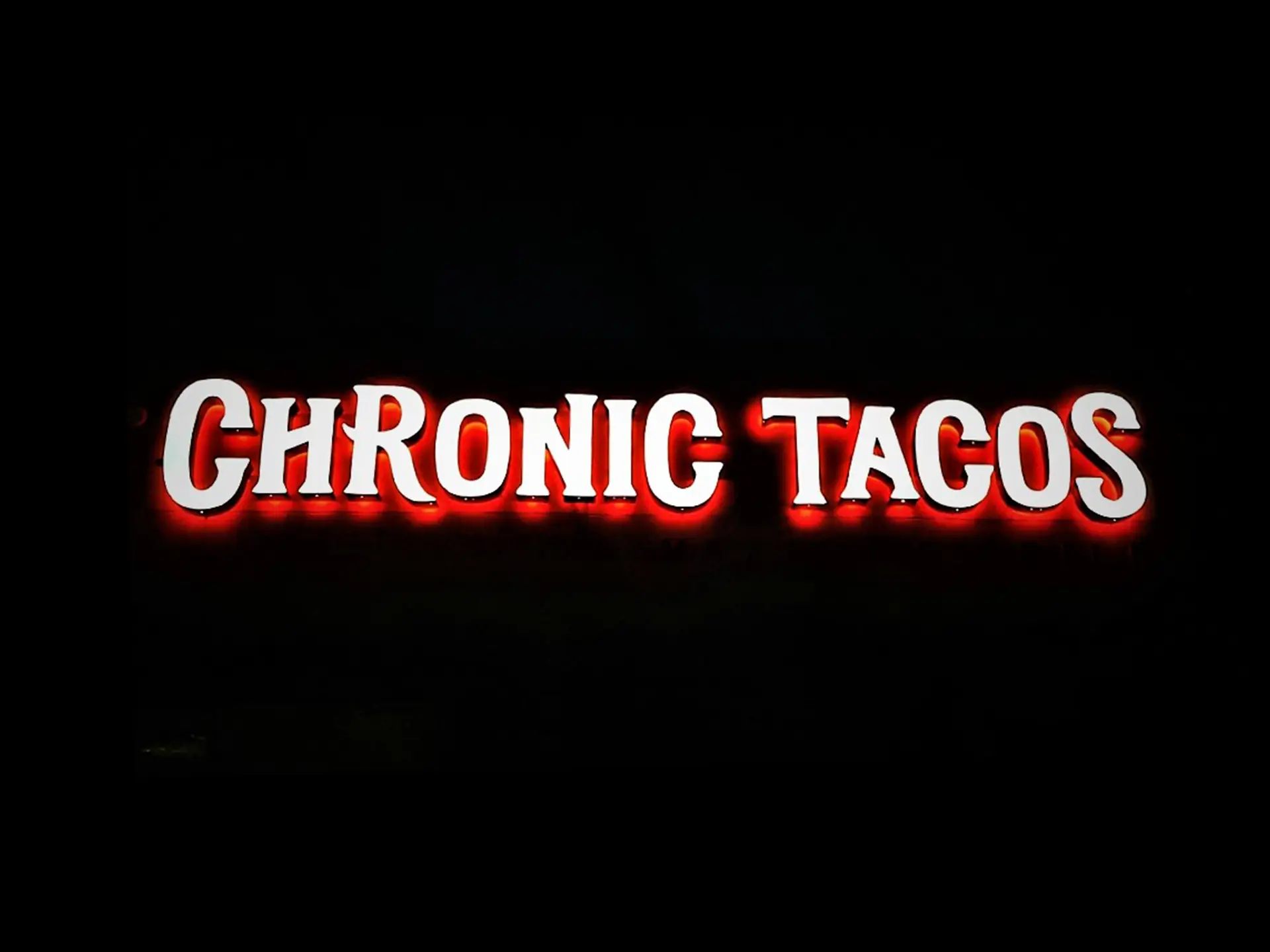
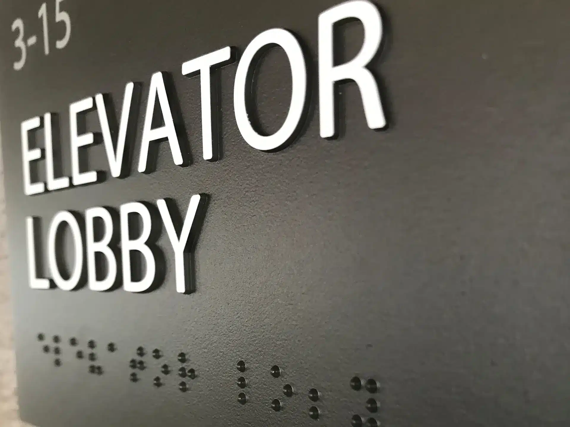
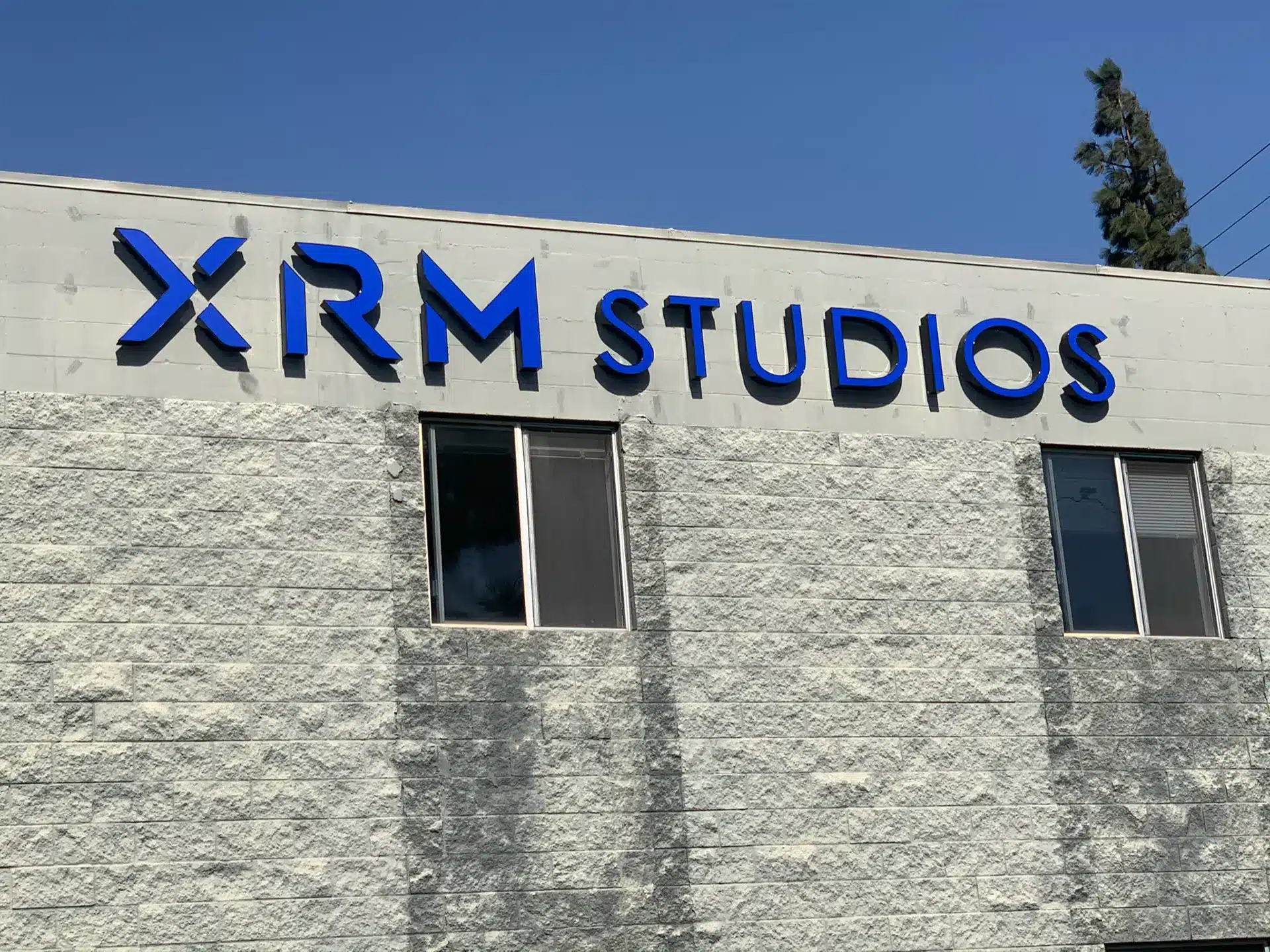
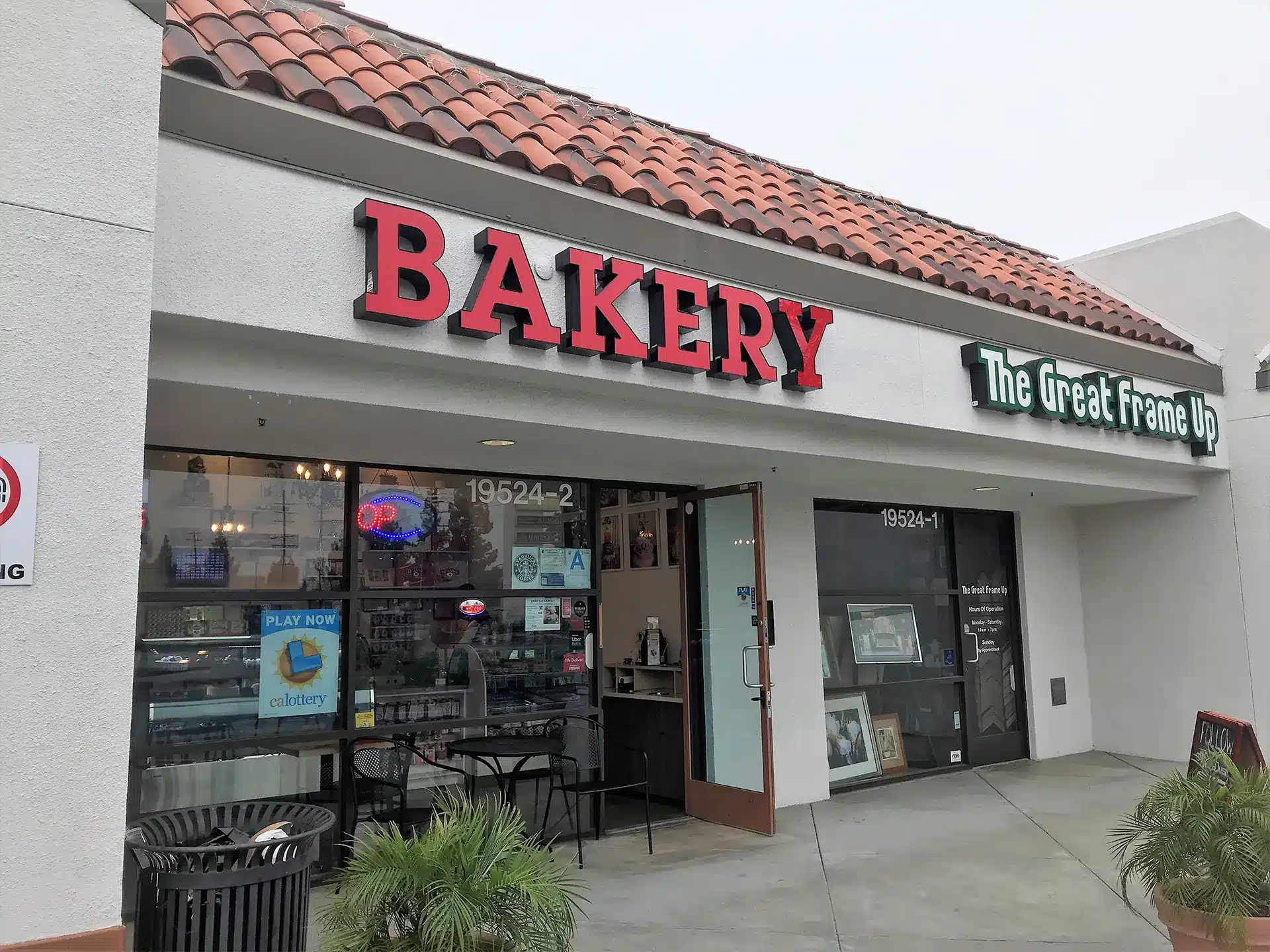
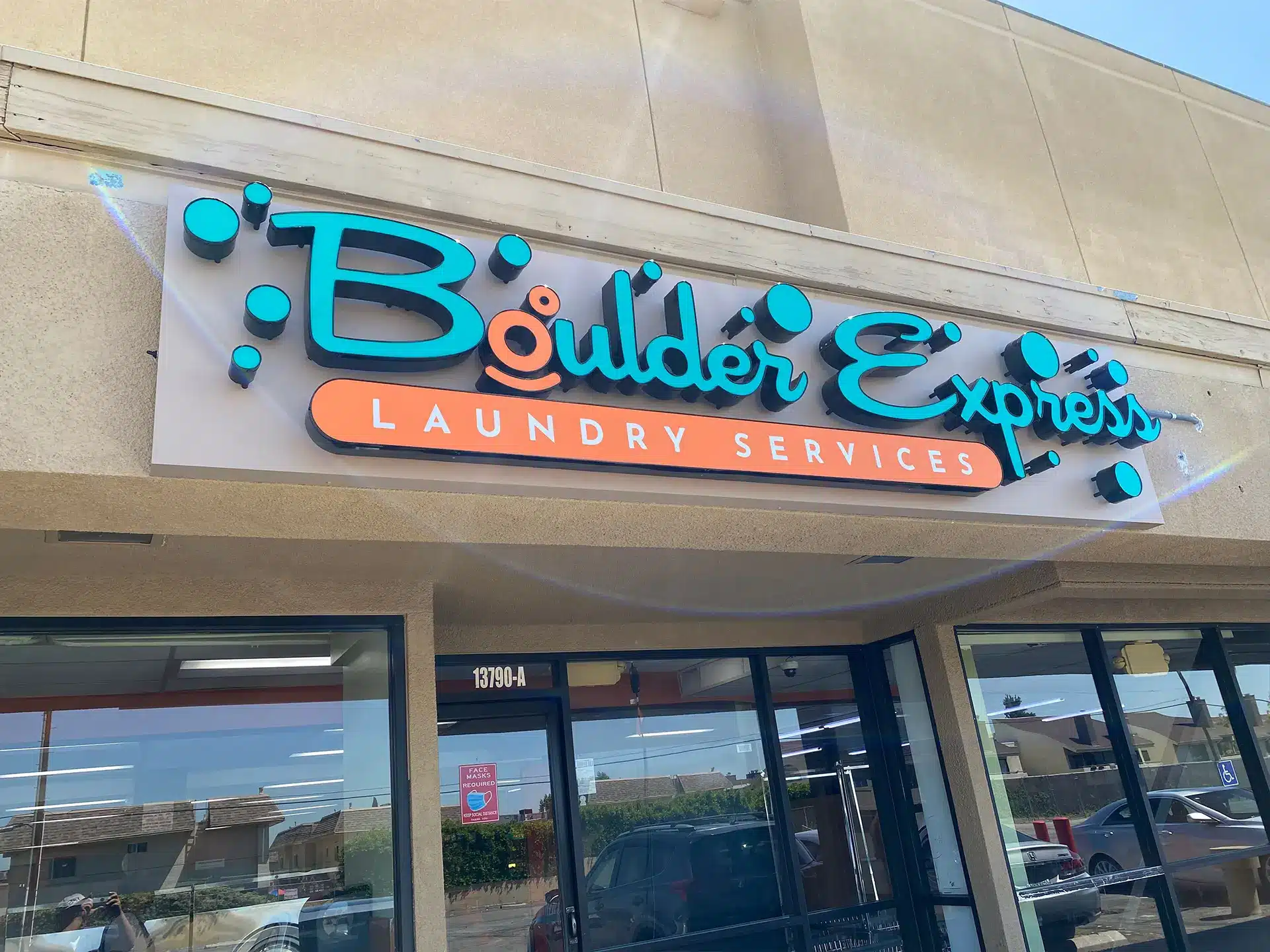
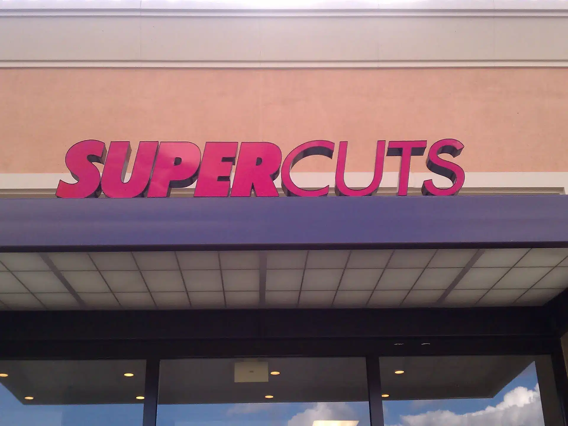
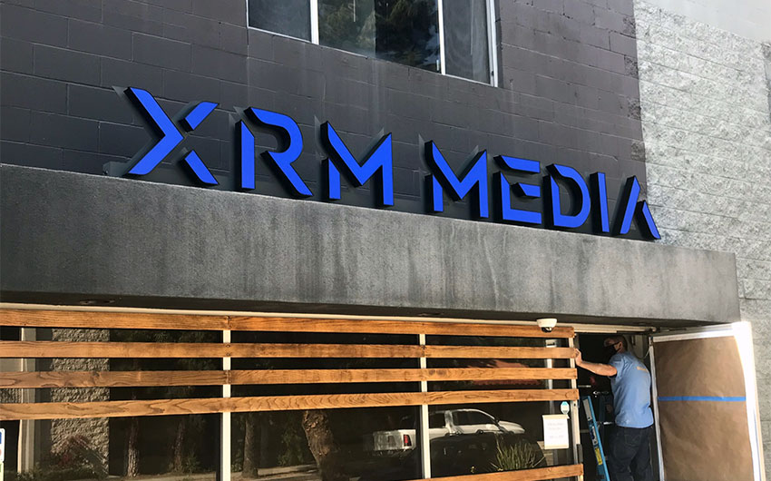
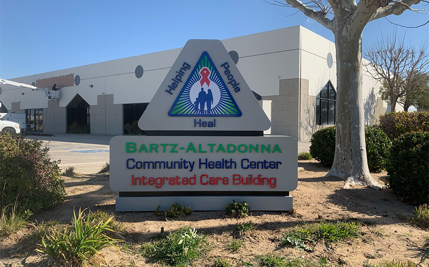
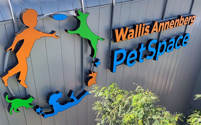
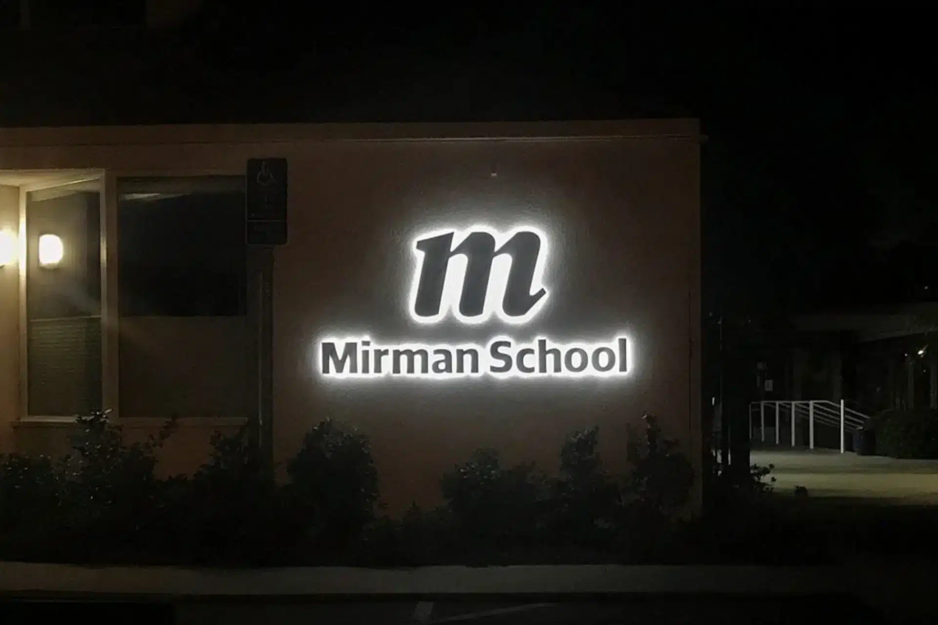
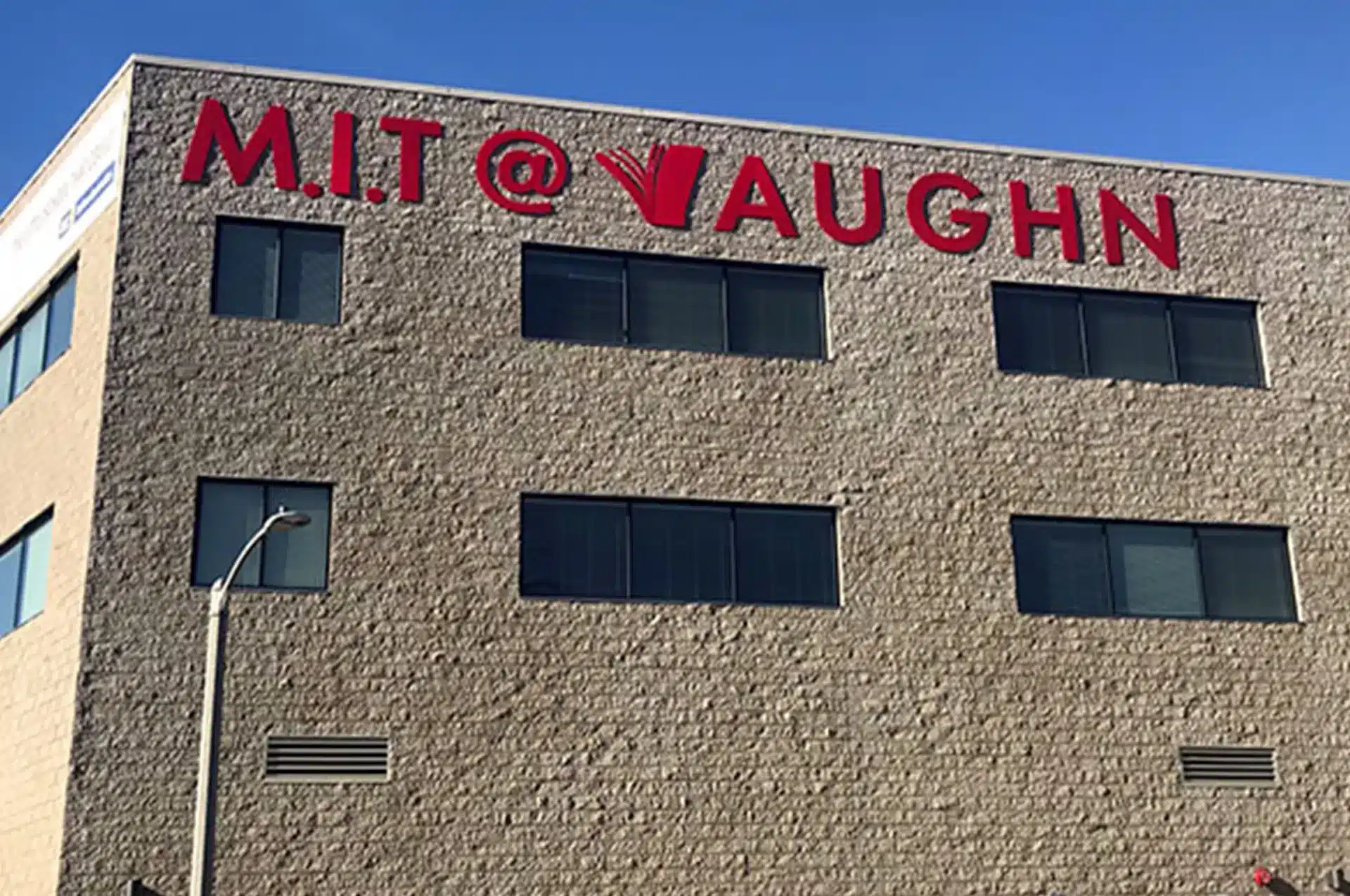
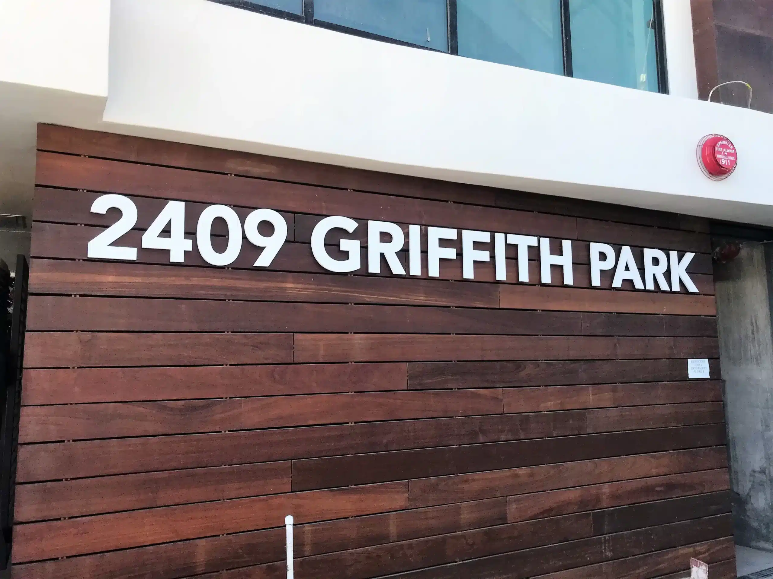
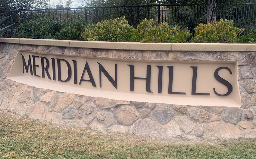
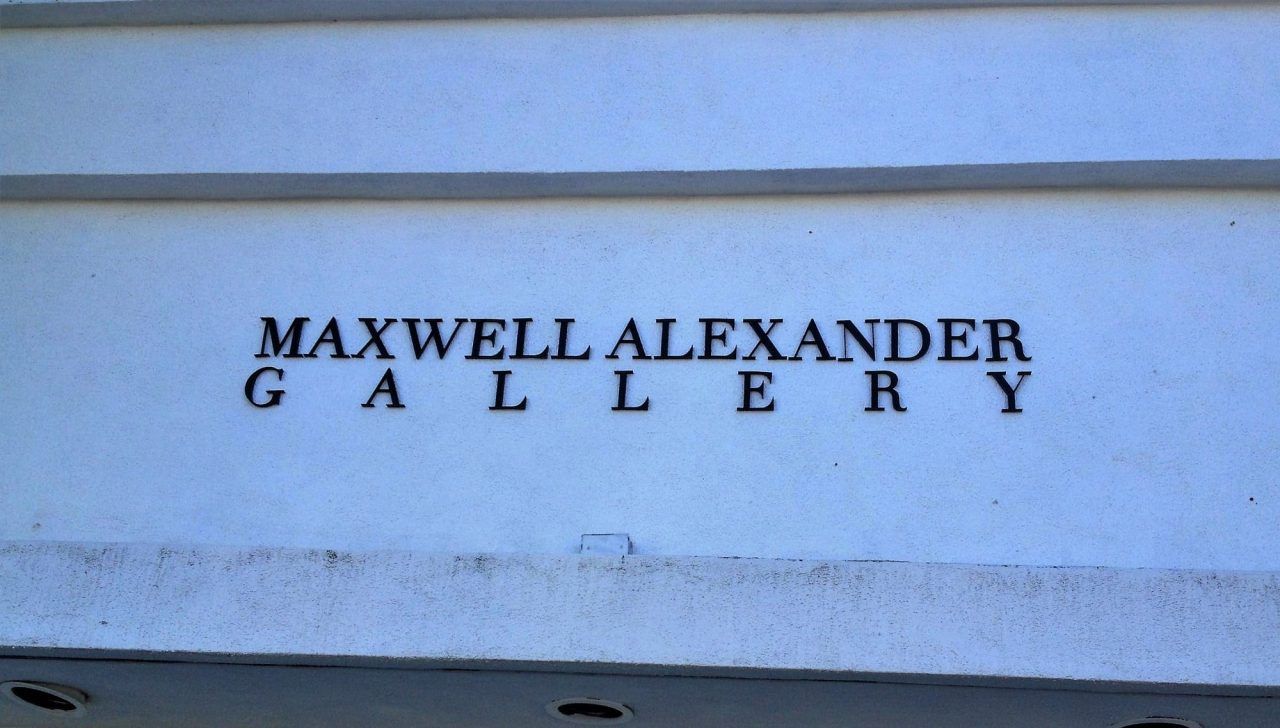
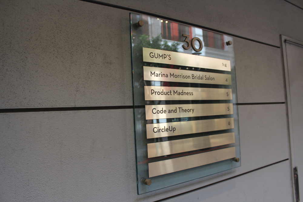
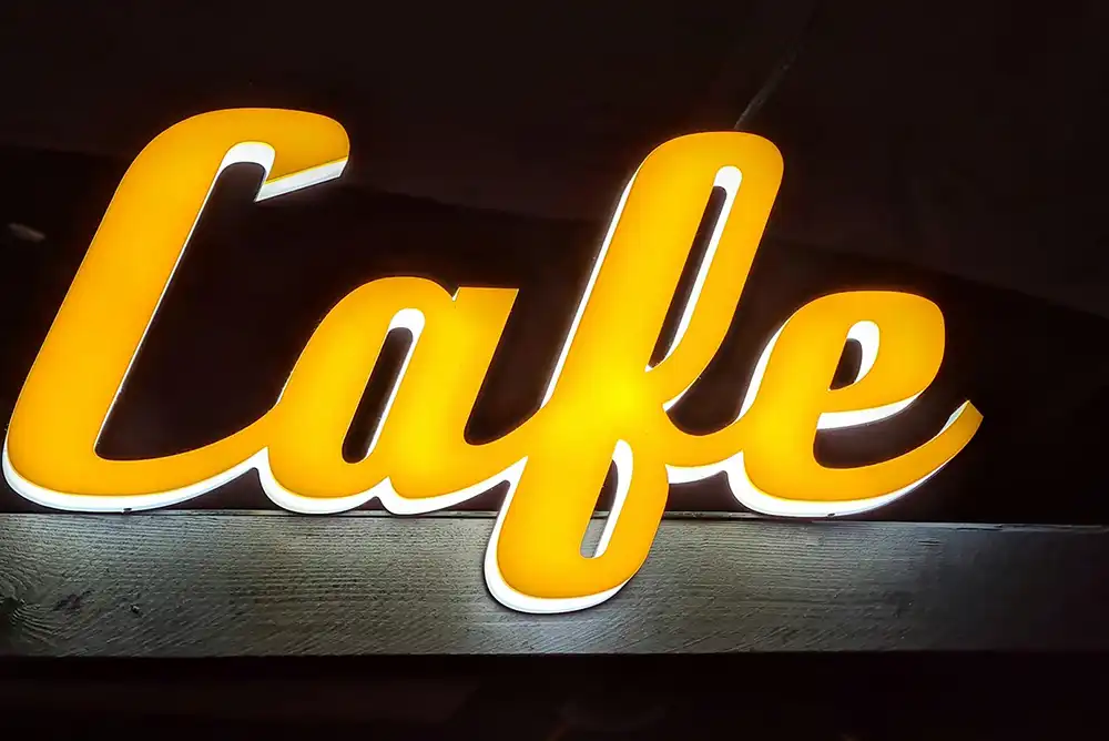
Dimensional letter signage remains one of the most effective ways to present a business name with clarity, depth, and authority. For Southern California business owners, these signs provide a professional, architectural look that complements both modern and traditional buildings. At